


Design #1

Design #2
Design #3
Design #4

Design #1
For this design, I created a petsitting business flyer. My goal was to make the flyer simple, but informative. I made certain words that I wanted to stand out red, and some bold. I tried to make the phone number and prices stand out for the readers looking for that information. I made the heading catchy, being “There’s No Place Like Home.” I used the rotating tool to separate “Petsitting Service,” as well as a different font. I made the design equivalent on both sides, with a large picture of a dog on the bottom left, and the smaller pictures on the right. I added stroke to the smaller pictures to make them appear more separate from each other. I also added drop shadow to the pictures to make them look more appealing to the eye. I did not add a background color, so that the information on the page would stand out more and the red and black text would be the main focus. If I was handed this business flyer, it would get my attention. I would first notice the dog and then I would notice the catchy heading.
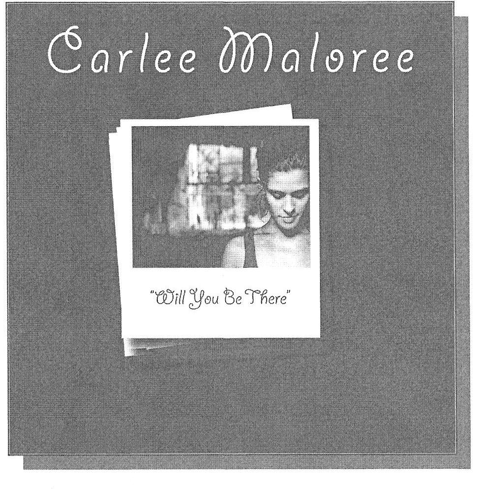
Design #2
For this design, I created a music CD cover for a fictitious artist, named Carlee Maloree. I made the background color brown. I chose brown to go along with the relaxing music genre I chose. I made lines on the front and back of the CD cover to add appeal and a sense of separation. The artist name, album and song titles are all in the same font. I did this to show that they all go together. I made the front of the CD cover look like Polaroid’s piled up in a stack. I did so by making white boxes, and adding drop shadows to show that the boxes are separate. I made the front of the cover very simple, so that the eye would not get distracted by unneeded design. I wanted the main focus to be the artist name, picture, and album title. On the back cover, I made the song titles the main focus. I feel as if when there is a picture or other design on the back of CD covers, my attention is taken from the song titles, which should be the main focus. I made the artist’s website in bold font to bring attention to it. The simplicity of my CD cover design should grab the audience’s attention.
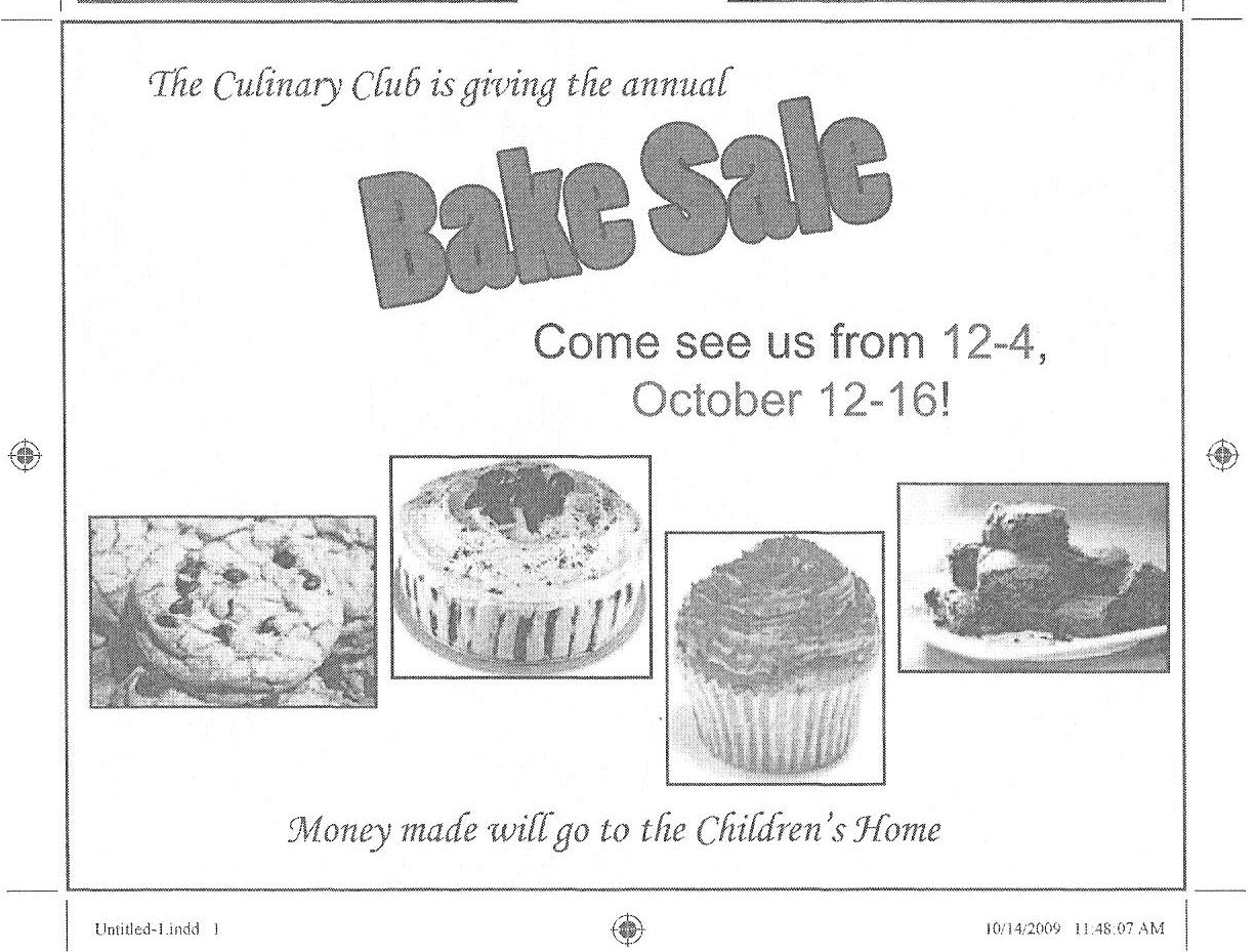
Design #3
For this design, I created an advertisement to promote the Culinary Club’s annual bake sale. The background color is light yellow to add color and make the ad eye catching. I made the heading, “Bake Sale” be the main attraction. The font is large, red, and I added a stroke. I rotated the heading to make it stand out more than the other text. I made the color of the date and times of the bake sale red, unlike the other text in that sentence; therefore, if the audience was looking for that information, then it would be easy to find. I added pictures of different bake sale goodies, so that the pictures would look pleasing to the audience and make them want to attend the sale. I added a stroke to the pictures to make a separation and make the ad look more professional. If I were to look at this ad, I would be interested in it because of the bright colors and the pictures.
Design #4
For this design, I created a company logo for Green Acres Landscaping. I thought the tree would grab the audience’s attention since it is big and colorful. It will make them look from the object, to the text within the object. I used only one font for the text, so that it would all go together. Since there are not many words on the logo, I decided not to add any other fonts. On the words, “Green Acres,” I added stroke to make the words seem to pop, and to make them more readable. I also added gradient to them to make the words be the main focus. I made the gradient be from the center, so that there would be a center focus. The reason “Landscaping” is set different from “Green Acres,” is so that the audience will remember “Green Acres,” since it is the company name. I made sure to add in “from lawn care to tree removal,” so that there would be a little explanation, but not too many details. If I were to see this ad, I would find it eye catching. I like that it doesn’t say much, but shows a lot.
CofC Home | E-mail | Home |
*Best displayed using Mozilla Firefox 5.0 or higher*